10 Webinar Landing Page Examples & Templates
You already know that a webinar is a great way to generate leads and sales for your business.
And maybe you’ve already created a value-packed presentation.
One that you know your audience will love.
But when it comes time to create your webinar landing page, you feel stuck. You don’t know what to include.
Or maybe you’ve already built a landing page and the response has been crickets.
You’ve got a sinking feeling that something is not quite right. But you don’t know what.
Don’t worry; you’re in luck.
This blog post will teach you how to create a high-converting webinar landing page by providing you with examples, templates and best practices to inspire you.
What can a webinar do for your business?
Webinars are an excellent way for businesses to share knowledge with their customers, connect with them on a more personal level, and market their products and services globally.
The potential global reach of webinars is limitless, as they can be attended by anyone who has access to the internet. Here are some interesting statistics about the effectiveness of webinars today.
The webinar market is projected to reach $800 million by 2023 (Letter.ly).
42% of marketers said that they were planning on using webinars in 2021 (Wyzowl).
While only 41% of marketers have actually hosted or participated in a webinar, 83% found it an effective strategy (Wyzowl).
Over 70% of webinar marketers say that webinars are either highly effective or most effective (Webinar Software).
Why create a webinar landing page?
You could create the best webinar presentation in the world, but without a high-converting landing page, you are unlikely to get many sign-ups. The purpose of a webinar landing page is to encourage visitors to sign up for your webinar. Yes, even if your webinar is free, you still need to convince people to give up their valuable time and attend.
An effective webinar landing page communicates important information about the webinar by answering the most frequently asked questions such as:
What day and time is the webinar happening?
Is the webinar free or paid?
What is the duration of the webinar?
Who’s presenting the webinar content?
What will I learn?
Now that you understand the importance of webinar landing pages, here is a template that includes the best practices that are typically found in high-converting landing pages.
7-point webinar landing page template
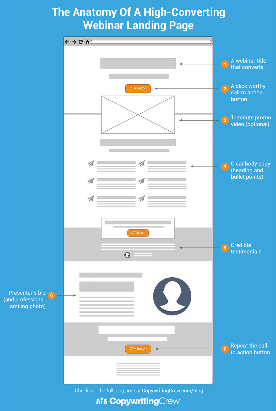
The Anatomy of a A High-Converting Webinar Landing Page
1. A webinar title that converts
Choose a webinar title that is likely to grab your customers’ attention. It should be relevant to the problems or challenges they are going through.
Your title should be clear, specific and actionable. When your audience reads your title, you want it to be a no-brainer for them to register because the topic you are covering is aligned with their problems or interests.
Here are a few writing tips to follow when writing a webinar title:
Use the word FREE (i.e., Free Webinar, etc.)
Be specific (7 ways is better than “many ways”)
Keep it short (no more than 10 words)
Use the words ‘How To’ (‘How To Grow Your Email List’)

A webinar title that converts
2. Clear body copy
The webinar might be free, but you still need to ‘sell’ the benefits of why people should register for it. You want to make them excited and curious about the information they will learn during the webinar and how it will benefit them.
To do this, I recommend writing a heading (i.e., ‘What You’ll Learn’) and bullet points (4 to 6 points).
Here are some bullet-point writing formulas to help you write your own:
- How to [benefit, i.e., save your marriage] without [common challenge, i.e., spending thousands on marriage counselling]
- 7 ways to [benefit, i.e., lose weight without starving yourself]
- [say what it is, i.e., a budgeting spreadsheet] that [and how it helps/benefits them, i.e., that saves you 10 hours a week]
- A simple exercise for [achieve result, i.e., closing more sales]
- The quickest and easiest way to [achieve result, i.e., get in beach body shape for summer]
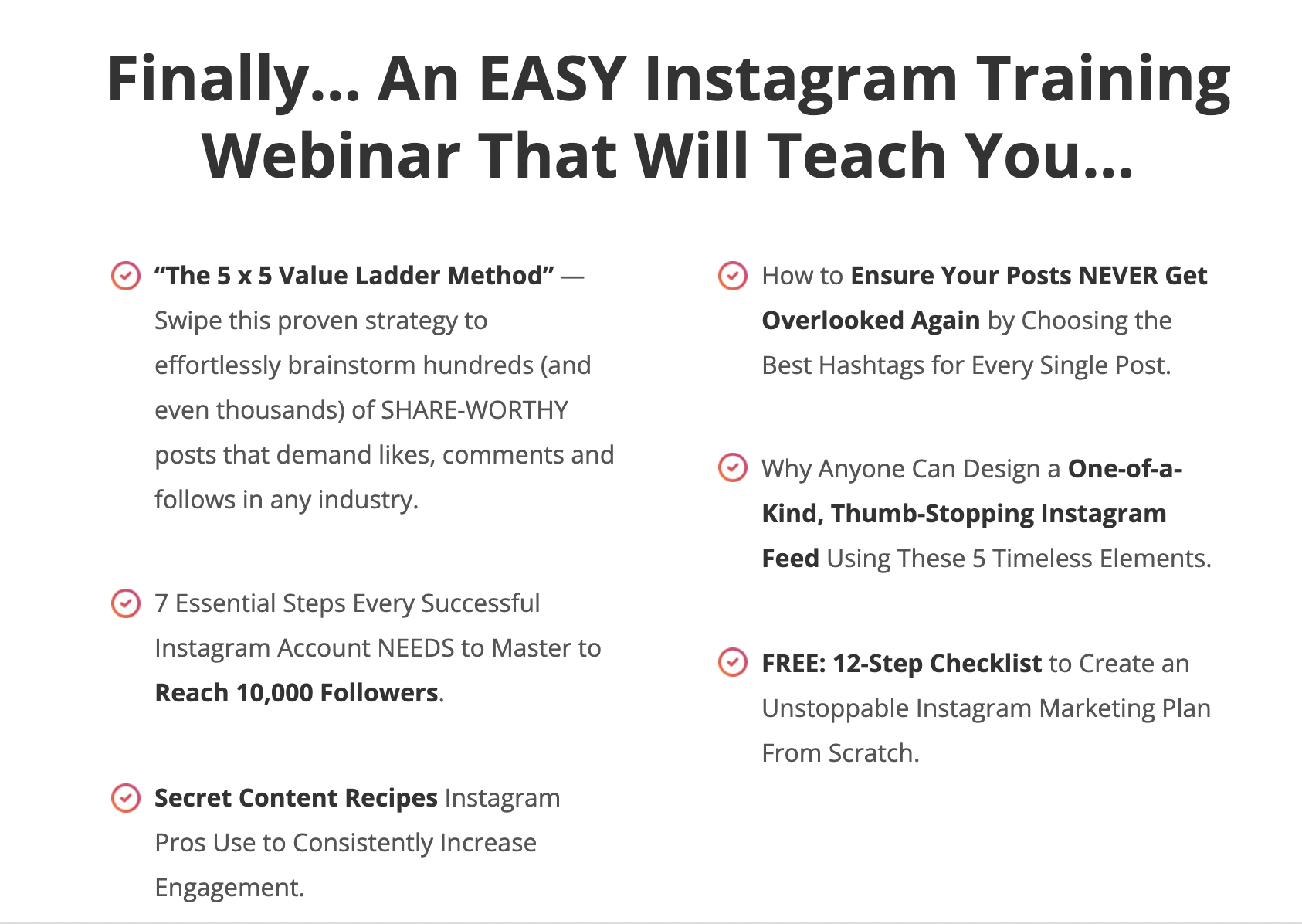
Clear body copy
3. A click-worthy call to action button
Call To Action (CTA) button copy is short (less than 5 words) and usually includes words like ‘free’ or ‘register’. You can also add words like “now” to increase the urgency and motivate visitors to reserve their spot faster. Here are a couple of examples.
- Reserve My Seat
- Book My Free Spot
- Claim My Free Seat Now
A click-worthy call to action button
4. Credible Testimonials
Testimonials are a great way to make the visitor feel more at ease by increasing credibility and trust. Your job is to look through testimonials provided by previous customers and find ones that fit the best practices below.
Specific and clear benefits mentioned
Person’s full name
Smiling photo of the person
Shorter testimonials work best
You may remove any rambling text from the testimonial, but do not add anything new that the testimonial giver didn’t say themselves.
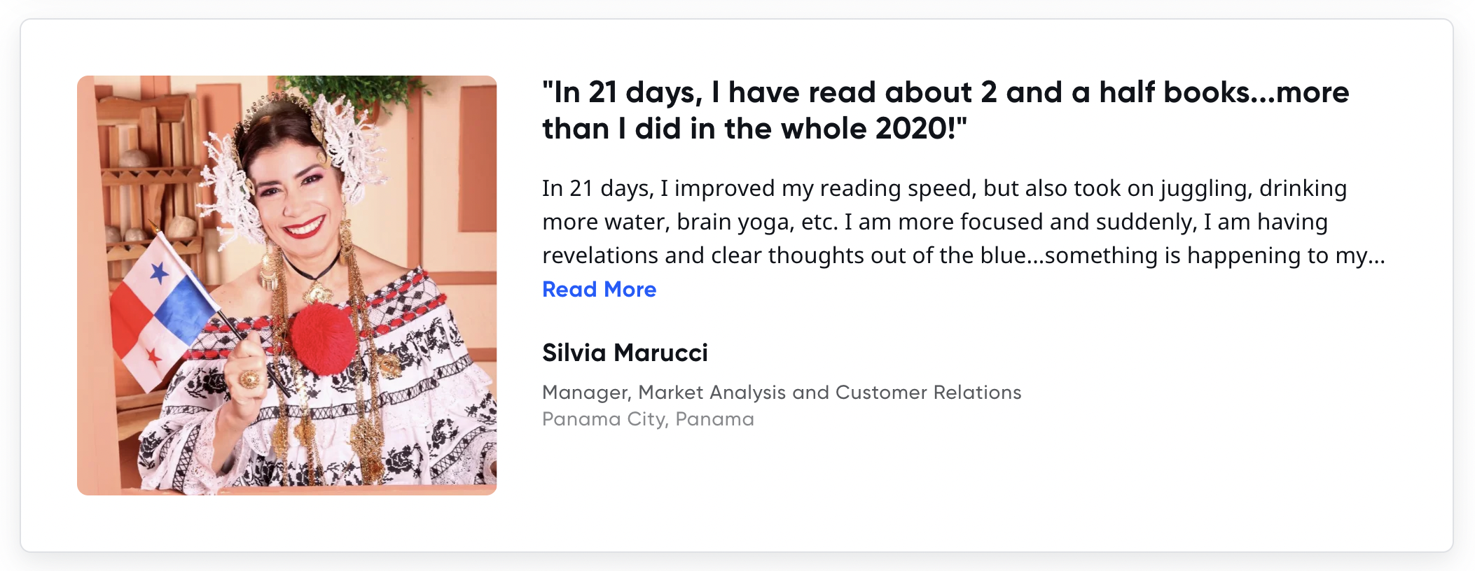
Credible Testimonials
5. Presenter’s Bio
In this section, you will write a short bio about the presenter of the webinar. The goal of this section is to position them as an authority or knowledgeable expert in their field—someone worth listening to who has valuable information and important insights to share.
Tips for writing the Bio section of this page:
- Include the specific achievements, qualifications, or results (that are relevant to the topic)
- Add their full name and business name
- Include a professional smiling photo of the presenter

Presenter’s Bio
6. Webinar Registration Form
The webinar registration form is the last step in the conversion process. It's where people can submit their email address and name to be sent a link to the presentation when it goes live.
A basic form would include fields for an email address and name. Some companies ask for more information like phone number, location, and even occupation, but the more personal information you request, the less likely people are to fill out the form.
There are many ways you can present this form on your website, such as a popup, sidebars, or embedded directly onto the landing page.
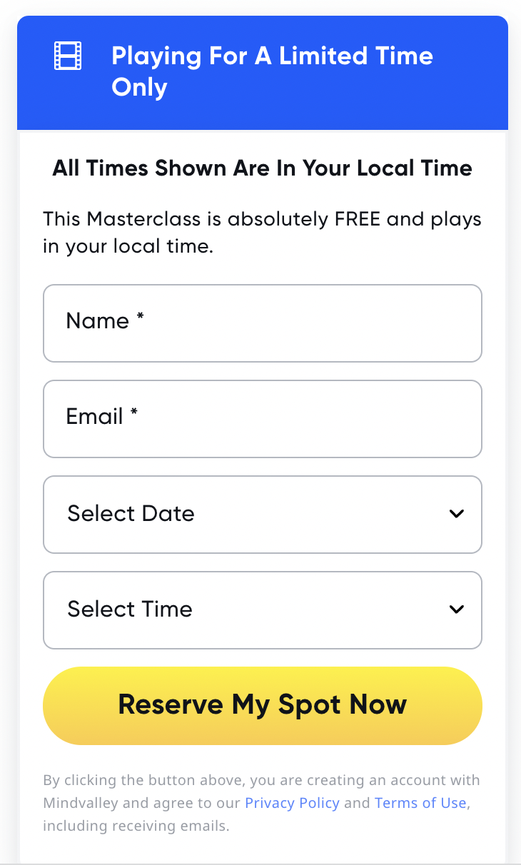
Webinar Registration Form
7. Appealing visuals
Adding eye-catching visuals such as images and videos can improve the user experience and also increase the conversion rate of your landing page. Here are the three different types of appealing visuals we recommend.
Presenter Photo: The most important image for your webinar registration landing page is a professional headshot of the presenter. The photo should be a smiling, approachable, and warm image.
Testimonial Photos: You can also include pictures of customers or attendees who have provided you with credible testimonials or reviews. These kinds of images prove that the testimonials are real.
Explainer Video: Explainer videos are great because they combine audio and video to explain a concept in a simple and understandable way. They're proven to be more effective than just text or audio—the video leaves an impression on the viewer.
Adding a 1 to 2-minute explainer video at the top of your landing page is a proven way to increase your conversion rate and attract more attendees.
10 Webinar Landing Page Examples
Here are 10 webinar registration page examples to inspire you to create your own. I also critique each page to let you know what I like and what I didn’t like about each one.
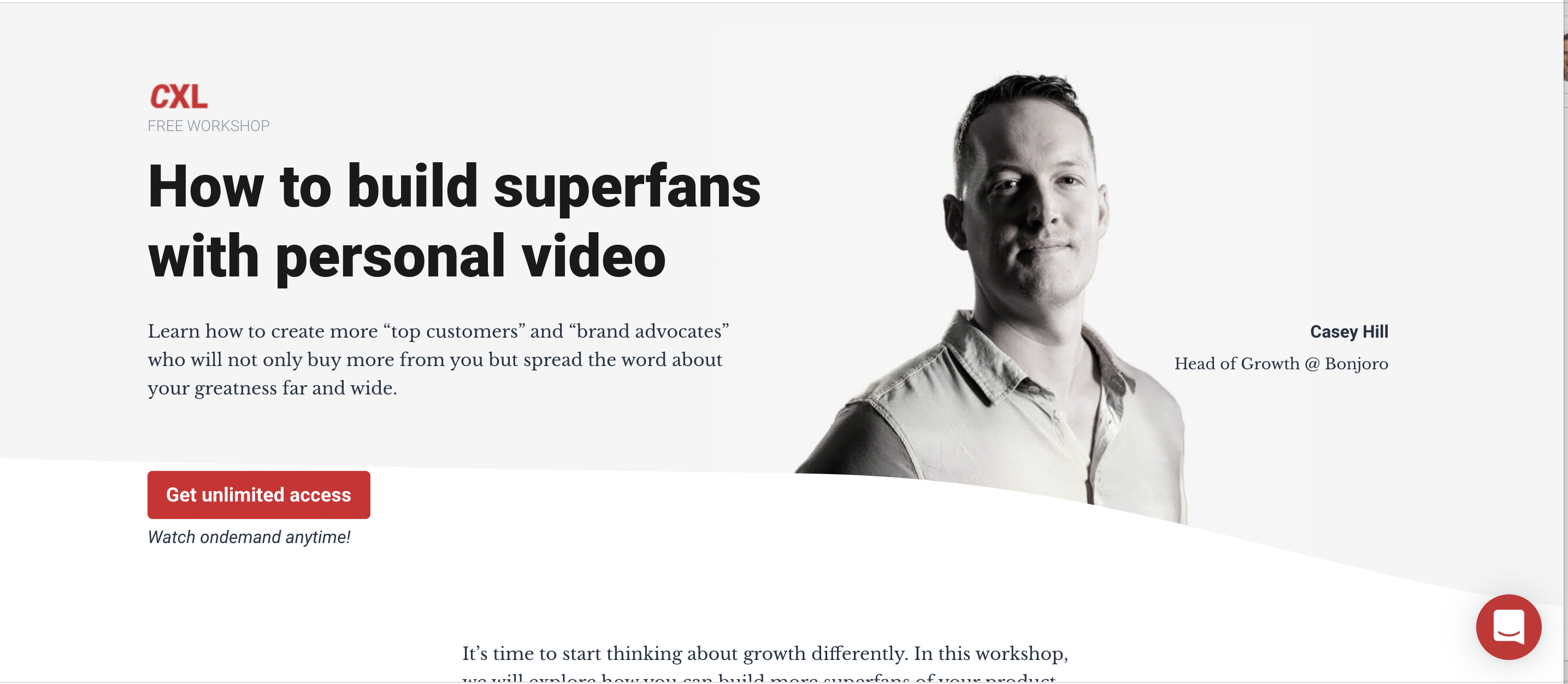
Conversion XL
What they did well:
The headline follows a proven framework. How to [benefit, i.e., build superfans] with [method, i.e., personal video]
- The 1-minute video provides a nice overview of what you’ll learn by attending the webinar.
- Hero image of the presenter along with the short yet informative bio positions him as an authority figure in the industry.
What they could do better:
The ‘get unlimited access’ is a bit confusing. I don’t know if I’m signing up for a free trial to a subscription or to a free webinar.
2. Hubspot

Hubspot
What they did well:
The headline is clear and to the point.
- The content of the webinar sounds relevant and interesting because they interviewed 50 social media industry pros about the latest tactics.
What they could do better:
- There isn’t much information about each of the presenters other than their names and positions at the company.
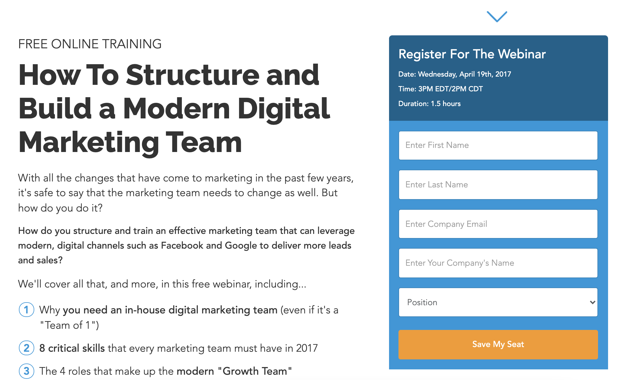
- The registration form is super long and is asking for a lot of personal information. People are unlikely to fill in such long registration forms.
- They didn't really answer the question of what I will learn by attending this webinar. It would have been good to have some bullet points that share the key topics they will be covering.
Digital Marketer
What they did well:
The headline is clear, compelling and mentions the key benefit.
The bullet points make me want to know more about the content being shared during the webinar.
What they could do better:
While the presenter's bio is well written, the image is broken so I can't see their photo.
4. TailWind
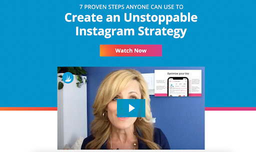
TailWind
What they did well:
The short explainer video does a great job of communicating what the webinar is about and why I should attend.
The call-to-action button is repeated three times throughout the page, which can help with increasing registrations.
Their landing page uses a clean and modern design that makes it easy to read and uses a lot of white space.
What they could do better:
Nothing! I thought this was one of the best webinar landing page examples on the list.
5. Moz
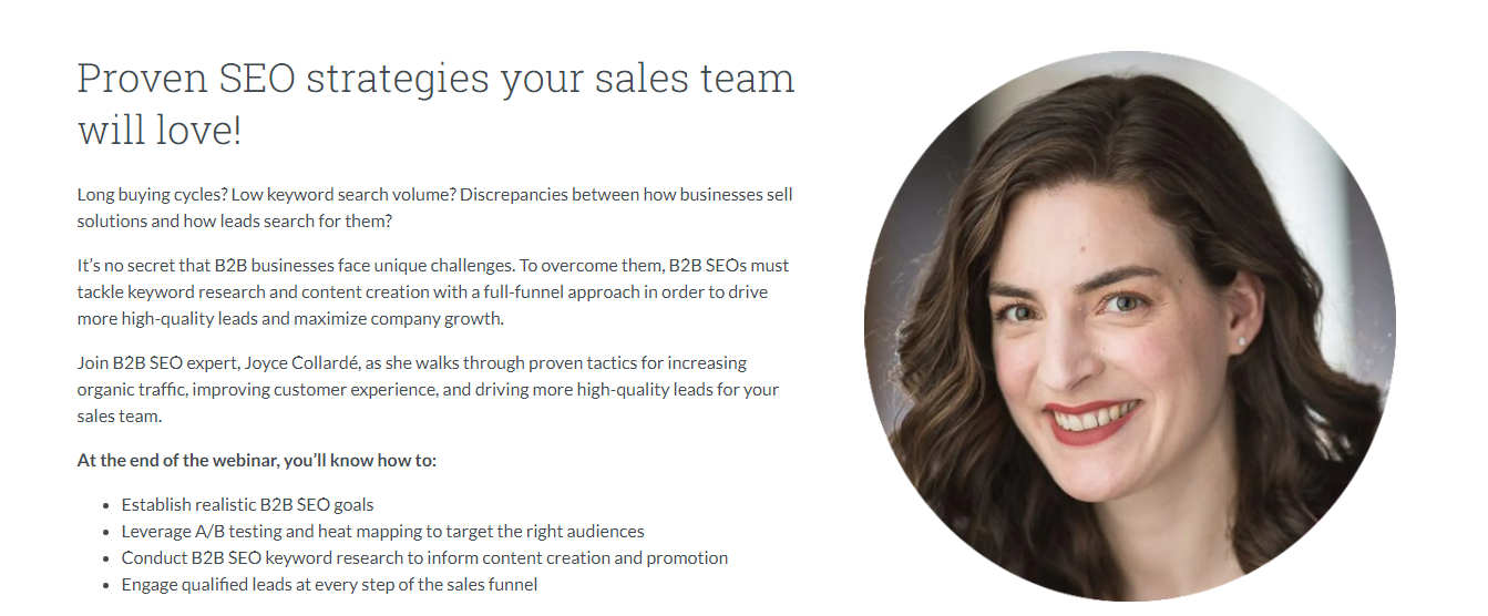
Moz
What they did well:
- The copy does a good job of positioning the presenter as an expert in her industry and provides compelling reasons about why we should attend the free webinar.
What they could do better:
- The website navigation menu has many distracting links that would cause people to leave the page without registering for the webinar. I would remove the navigation bar from the landing page.
- Their registration form asks for too much information. I would ask for just the name and email address to increase registrations.
- The call-to-action button says ‘submit’, which doesn't inspire people to click. I would replace it with ‘free registration’. oOr ‘register my free seat’.
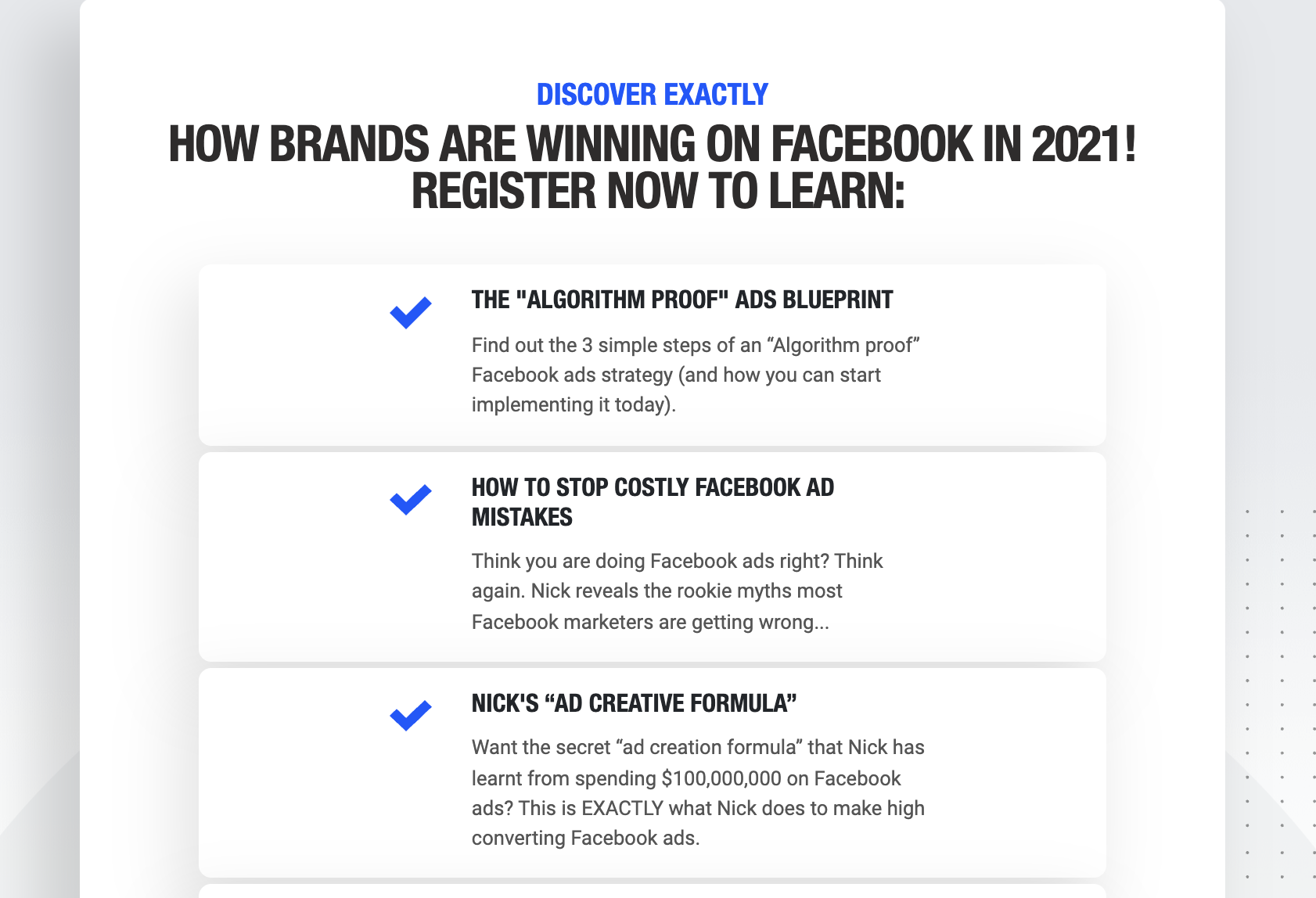
Foundr Magazine
What they did well:
The countdown timer creates a sense of urgency which would be effective at getting more people to register now.
The page includes a lot of video testimonials which are effective at increasing trust and believability.
The headline is excellent because it mentions a key benefit the audience cares about and to overcome a common problem.
They use a lot of client case studies which would increase the credibility and also desire for visitors to attend the webinar
What they could do better:
I think this is one of the best examples on the list. The only thing I might change is the video player because when you click ‘play’ it asks you to enter your name and email to access the webinar. While this might be an effective strategy it felt like bait-and-switch.
7. MindValley

MindValley
What they did well:
- The headline mentions not one but two clear benefits that the target audience really cares about.
- There are lots of great bulleted points that offer reasons why you should attend the webinar.
- The landing page uses a lot of compelling testimonials that help to boost its credibility and believability.
- There are photos of the presenter with Bill Gates and other industry tycoons, which only further boosts his credibility as the presenter.
What they could do better:
- While I do really love this landing page, it would be interesting to see a shorter version of the page as it’s pretty long. Mindvalley could test them and see which one gets more people to register.
8. Meducate

Meducate
What they did well:
The question headline is an effective way of grabbing the reader’s attention.
Their short promo video does a great job of promoting the webinar.
The bullet points mention six key questions the audience cares about that will be answered during the webinar.
The bios of the two presenters are well written and mention the relevant accomplishments of each presenter.
What they could do better:
There isn't really anything I would change about the Meducate webinar landing page.
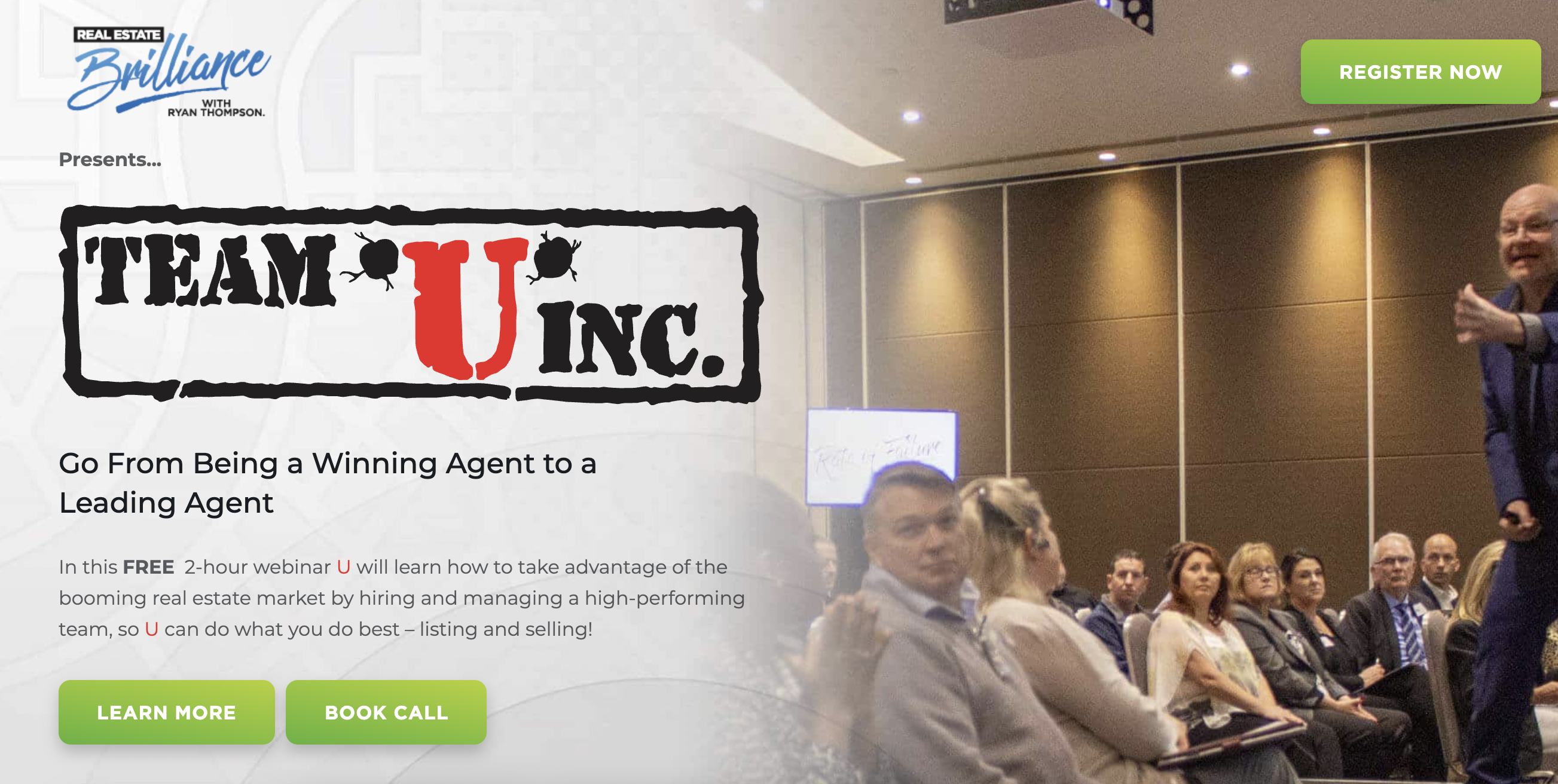
Real Estate Brilliance
What they did well:
- The many visual trust elements like award logos and media mentions help to boost the trustworthiness and credibility of the page.
- Video testimonials are an excellent way to demonstrate social proof.
- The ‘what you'll learn’ section provides many compelling reasons why we should attend the free webinar.
- The brief explainer video from Ryan Thompson does a great job of promoting the webinar.
What they could do better:
- The company logo takes up too much space in the important ‘above the fold’ section of the landing page. I would remove the logo to make it much smaller.
- Having two call-to-action buttons is a mistake because it can cause indecision. I would only have the ‘register now’ button on the page.
10. Slack
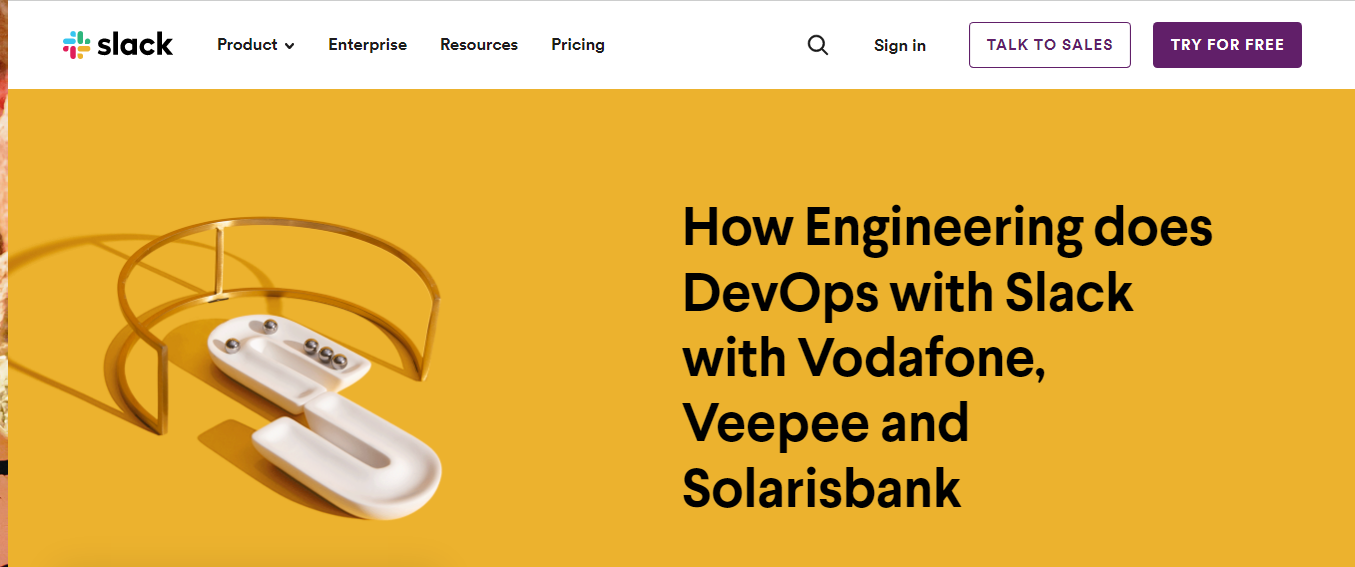
Slack
What they did well:
- The headline positions Slack as an authority by mentioning three big name companies that use its technology.
- The copy does a good job of clarifying who should attend the webinar (engineers, owners and admins, etc.) and what they will learn.
What they could do better:
- There are many links to other pages, webinars, and call-to-action buttons provide too many opportunities for the visitor to leave this page without registering for the free webinar. A more focused page with just one call-to-action button would yield better results.
- The registration form asks for 7 different pieces of personal information, which will result in fewer people filling out the form.
Why choose Copywriting Crew to write your webinar registration page?
Copywriting Crew is a professional copywriting agency that helps businesses attract more attendees with compelling webinar landing page messaging.
Our copywriters are skilled at using words to get people to take action. We write webinar registration pages that will convince prospects to sign up for your online event, and we can do all the content creation you need—from blog posts to whitepapers and more.
We'll make sure your webinar registration pages are persuasive and engaging. Go here to find out more about our copywriting services! You can also click here to order your webinar registration page content.

Hire Top Copywriters
Frequently asked questions about webinar landing pages
Question: What should be on a webinar landing page?
In order to create a successful webinar landing page, we recommend following these best practises:
- A webinar title that converts
- Clear body copy
- A click-worthy call to action button
- Credible testimonials
- Presenter’s Bio
- Registration form
- Appealing images
Question: How do I create a webinar landing page?
Webinars are the best way to generate more leads, build your email list, and grow your business. If you're looking for help with setting up your webinar landing page, you can use one of the powerful page builder tools available at https://www.website-builder-tool.com
Question: How do you optimise a webinar landing page?
Unlike other types of marketing collateral, webinars are highly interactive and based on dialogue. As such, your landing page should be focused on providing the audience with the critical information they need to know in order to take part. You can use a call-to-action button or a video that is playing that would lead people into the webinar.
Question: How do I create an event landing page?
Check out our informative blog post for instructions and best practices on how to create a high-converting event landing page.
Further reading
Insert external links to our other blog posts on similar topics.